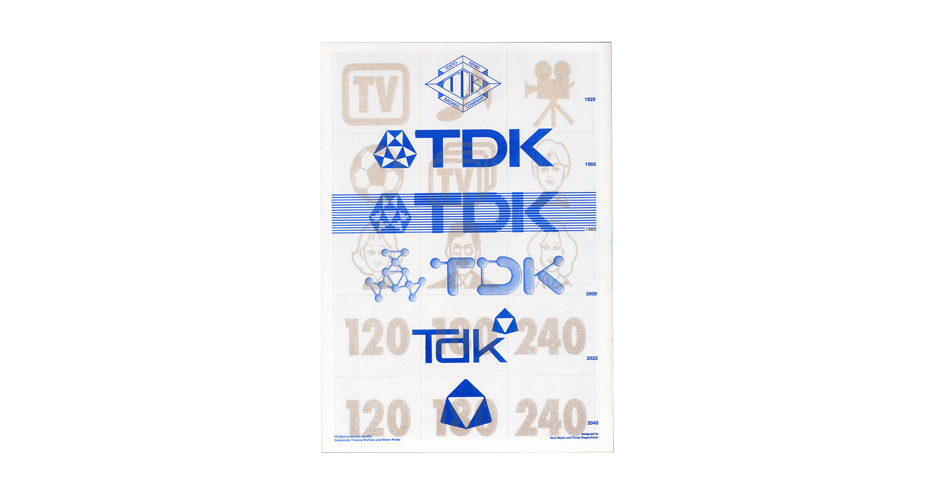


A time-travelling rebrand for TDK featuring
five logos for 1920, 1980, 2000, 2025,
and 2040, alongside the original 1960s logo.
Displayed in a zine inspired by vintage ads
from each decade, printed with risograph
for a retro-modern look.
In collaboration with
Sara Maric


An infographic poster that delves into the
topic of breast cancer, focusing on tumor
prevalence, size, stage, and survival rates.
Based on studies from 1975 to 2011 in the USA,
the poster emphasizes the importance of
early detection and illustrates how advanced
tumor spread drastically affects survival
chances. The goal is to raise awareness and
encourage preventative actions.


The poster won the design contest for the
Zürcher Segel Club's Pfingstregatta with
its simple, minimalist concept. It features a
buoy from the regatta,
presented in a clean
and reduced style, capturing the essence of
the race. It was silkscreen printed and
displayed across the city.
In collaboration with Elisa Käser


A playful title font designed using elements
from the logo of the card game Frantic,
featuring bold, rounded letterforms and
exaggerated curves.
With a mix of
geometric structure and soft shapes, the
font expresses a fun, modern vibe.


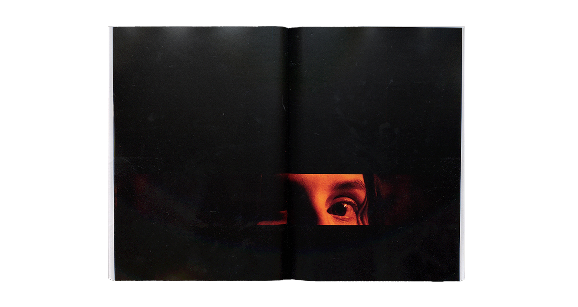
An editorial design project based on a Tatort Zürich
script and a photo series inspired by the
iconic intro of Tatort,
a renowned Swiss crime TV
show. Structured around key locations from the
episode—such as the crime scene, detectives' office,
and suspects' houses—the book
is divided into
chapters following these settings. Photos are
interspersed as teasers throughout, leading to a full
photo series in an intense interlude where the victim
is killed,
heightening the drama. The script was
provided by SRF, Swiss Radio and Television, while
the photo series was self-created to enhance
the visual storytelling.


A silk scarf pattern featuring handmade symbols inspired by
Zürich's industrial District 5. Crafted from wire and digitized
in Adobe Illustrator,
the symbols capture both the industrial
and artistic essence of the area. The metallic wire look
reflects elements like wire fences, while symbols such as an
arrow represent transportation;
an eye symbolizes visual
culture; and a cocktail highlights the nightlife scene.
✗


